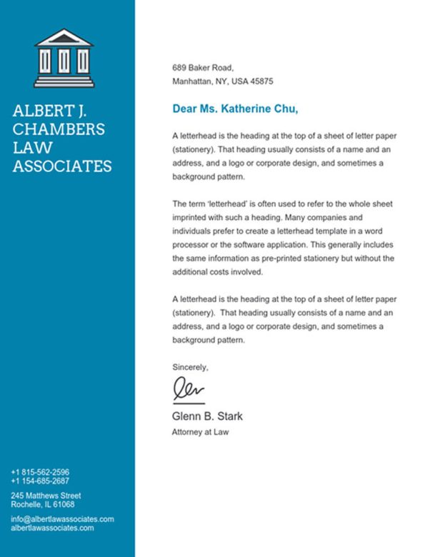
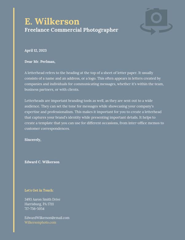
A letterhead is an important part of your business. You can use it for different purposes, like writing to clients or sharing information with others in the workplace.
Here are some tips that will help you make a business letterhead design that stands out:
Know what you need before designing
Before creating a letterhead design, know why you’re doing so. Knowing your purpose will allow you to choose fonts and colors appropriately.
For example, if you’re sending out invitations, choose bright colors for your layout so they can be seen easily against envelopes. If you want to write proposals using the letterhead, try using crisp lines and neutral colors so they look professional when attached with other files to create a proposal packet.
The font you choose should reflect the industry you’re in
Choose a font that portrays your brand effectively. If you’re writing for a fashion designer, try using fun and eye-catching font styles.
Also, consider how large or small your letterhead will be printed. While it’s tempting to go with fancy fonts so they look good on letterheads, if their size is too small, they’ll be hard to read, defeating the purpose of having great letterheads.
Again, keep in mind the purpose of your letterhead as well as how it’ll be used as these two factors can determine which letterhead fonts you should use. Smaller versions can still reflect quality even if they don’t have fancy words. Remember, private individuals who send out invitations may not want to spend on letterheads. This is why the simpler, the better.
Choose the right material
You can use different materials for your letterhead design. If you want to go traditional, consider using papers that don’t come cheap. If durability is not a problem for you, try using cardboard instead. With the latter, you can choose between lightweight paperboard and foam boards which are sturdier.
When choosing your letterhead, make sure that it reflects your brand
For example, if you’re writing for a fashion designer, try using lightweight papers like tissue or even silk paper. You can also choose matte finish colors to provide contrast against the design of your letterhead template. If you’re creating an invitation, use papers with colorful designs to match your theme.
When choosing colors for your letterhead, take a side and use a single color or a combination of colors. Simple designs work best because it allows the text to stand out. If you’re sending invitations, choose bright colors that will stand out against envelopes. For example, if you’re writing to potential clients, try using neutral colors like black and white to attract attention. For your letterhead, you can use colors like red, blue or green which most people associate with drawing clients’ attention.
Think about the future of your letterhead design
Once you create a nice-looking letterhead, stick to it whenever you’re writing letters. Even if your business changes and your clients expect something different, stick to your original letterhead design as it portrays the brand that you’re promoting.
Take note: Letterheads should not be confused with headed paper, which is writing paper bearing an owner’s name and address at the top of each page.
Using uniform spacing can make your letterhead design more organized
You’ll need uniform spacing no matter what type of letterhead you’re creating. Letters with uniform spaces will look more professional and polished than letters where there are noticeable gaps between words. Adding uniform spacing manually can be time-consuming so consider using a typing program to help you achieve this.
Advanced typography tools may also come in handy when doing manual editing since they can provide greater accuracy in changing font sizes and colors.
The paper color should suit your industry
People have different perceptions about paper colors. Some prefer lighter shades while others want darker shades for their letterheads. Paper colors vary according to industry. For example, people who serve the public would need a bright white paper as they come in contact with more people on a daily basis.
Don’t forget about the finishing touches
You can use different design elements to make your letterhead stand out. You can include a logo or some graphics so it doesn’t look boring and plain. Include some punchlines or messages that reflect your brand effectively. Frame the written content on your letterheads to give them a classy touch.
While you want your letterheads to look aesthetically pleasing, don’t forget their role as a tool for business communication. Make sure that it’s easy to read and looks professional at all times. Remember these tips next time you’re designing letterheads and see how they improve the look and functionality of your business.
To get started on making your letterhead, sign up with Venngage. The platform has high-quality and creative letterhead templates and letterhead examples you can tweak based on what your business needs.


