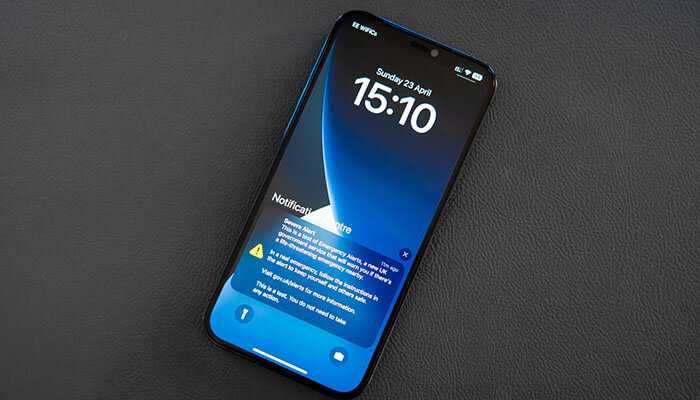
Ever feel like your phone is yelling at you? You’re not alone. In today’s notification-filled world, curating effective notification system design is a must.
Notifications keep everyone informed, but too many can be overwhelming, right? So, how do you design alerts that get noticed and acted upon, without causing frustration? Here’s the secret: prioritize user preferences.
This article explores how to design notification systems that deliver the right message, through the right channel, at the right time. By understanding user behavior and notification preferences, you can create a system that enhances the user experience and builds a stronger connection with your app.
Know Your Users and Their Notification Preferences
Ever check your phone to see a flood of notifications? Some might be useful, but others just clutter your screen. This is why understanding your users and their notification preferences is key.
Think about it: what kind of alerts do you find helpful? Is it breaking news or a reminder about an upcoming meeting? Do you prefer a quick email notification or a pop-up on your phone?
By knowing your users’ habits and notification preferences, you can craft a system that delivers the information they truly care about, not just a barrage of alerts. This personalized approach keeps them engaged and reduces notification fatigue, making your app a welcome guest on their phone, not a noisy intruder.
Prioritize Ruthlessly: Not All Notifications Deserve a Push
Not all notifications are created equal. Distinguish between critical alerts that require immediate action (e.g., security breach) and informational messages (e.g., friend requests). Reserve the most attention-grabbing tactics for high-priority notifications.
Channel Options: Finding the Right Fit for User Notification Preferences
Email, SMS, push notifications, in-app alerts – the list goes on. Provide users control over their notification channels and frequency. Let them choose the method that best suits their needs, like a notification Inbox for web & mobile apps like Magic Bell, which consolidates alerts from various sources into a single stream. This empowers users with notification management and reduces notification fatigue.
Segmentation is Key for Targeted Notifications
Don’t blast everyone with the same messages. Segment your user base based on demographics, behavior, and notification preferences. This allows you to send targeted notifications that resonate with each user group. Imagine sending stock price alerts only to users who have invested in that particular company.
Clarity is King in Effective Notification Design
Keep your notifications concise and clear. Focus on the essential information: what happened, why it’s important, and what action (if any) is needed. Avoid jargon and overly promotional language. Remember, effective notification design prioritizes user experience by delivering clear and actionable messages.
Timing is Everything for Successful Notifications
Timing is crucial for notification success. Just like you wouldn’t call a friend at three in the morning, notifications shouldn’t arrive at inconvenient hours.
Think about your users’ routines. Are they checking their phones first thing in the morning or unwinding in the evening?
By sending notifications during typical usage times, you increase the chance they’ll be seen and acted upon. Notification tracking can shed light on user behavior and help you pinpoint the perfect timing for your alerts.
Personalization Adds Value to Notification Systems
A notification that addresses a user by name or references their past behavior feels more relevant and engaging. For example, an e-commerce platform might send a notification reminding a user about abandoned items in their cart. Personalization goes hand-in-hand with understanding user preferences through notification settings.
Actionable Notifications Empower Users
Don’t just inform, empower. Include clear calls to action within your notifications. This could be a button that directs users to a specific page or a link to take a particular action. When designing your notification API, ensure it allows for the integration of actionable elements.
Make it Visually Distinct: Notification Design with Impact
Don’t let your notifications disappear into the noise. Use color, sound, and iconography strategically to differentiate priority levels and grab attention. However, avoid overly flashy elements that can be annoying. Effective notification design balances grabbing attention with a positive user experience.
Test and Iterate for Optimal Notification Systems
The key to a successful notification system is continuous improvement. Track user engagement metrics like open rates and click-through rates. A/B tests different notification formats, content, and timing to see what resonates best with your audience. Notification tracking data is essential for this iterative process.
Final Thoughts
Crafted notifications are like a tap on the shoulder, not a scream in the ear. Respect user preferences, prioritize clarity, and deliver value. With these tips, you can design a thoughtful notification system that informs without annoying. So, ditch the notification fatigue and create a system your users will love. They’ll thank you for it.


