Every good entrepreneur has their own website. Creating the website is easy; getting traffic to the website takes a lot of time and usually money. Search Engine Optimization (SEO) can be highly effective but takes lots of time and effort to do it properly. Paid advertising on search engines and social media can provide immediate traffic but can be expensive. A combination of paid and organic is usually the best tactic for driving quality and relevant traffic to your website.
Many people make the mistake of driving traffic to their website but not looking at the user behavior. For example, if a typical user only spends a few seconds on one page of your website and leaves, either the traffic is low quality, or there is an issue with your website. Ultimately, you want as many users as possible to convert to either a lead or a sale. The process of optimizing your website for these goals or conversions as they are referred to is called “Conversion Rate Optimization” or CRO.
This article will look at the best practices for optimizing your website to convert as much traffic as possible to leads or sales.
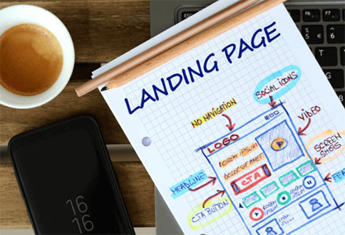
Visualize & Design Your Landing Page
A landing page is a webpage that users “land on” when they click your ad. It should be specific to the ad in every way possible. For example, you don’t want to create an advert for men’s red polo shirts and send users to the homepage for all men’s clothing – you want them to land on a webpage that sells men’s red polo shirts.
An excellent way to develop your landing page’s structure is to check out all of your competitors, including some of the major players such as Amazon, Walmart, etc.
See how they use imagery, where the images are placed, what headlines are used, and take note of the color and text of all the buttons such as “Add to Cart” or “Inquire Now” for service-based websites.
A typical structure for a service-based landing page might include:
– Hero Image & Banner with a CTA* button that scrolls to main content
– Trust signals such as “Featured In” content
– Bullet points on product benefits
– Reviews
– Large Form on the right-hand side
– Guarantee
– Additional CTA button
*CTA stands for “call to action,” such as a button that says “inquire now” or “learn more.”
A hero image is usually a large image, which shows the product in use or the service being delivered.
Test Everything
The first thing to do when it comes to CRO is to make sure that you are tracking everything. Ensure that you use tracking URLs and Google Analytics to see how many users arrive from different sources and different campaigns and how they behave on your website.
Once tracking is in place, ensure that you have a tool in place that allows you to track the effectiveness of any design changes on your website. For example, using a tool like Google Optimize or VWO, you can change headers, Call to action (CTA) buttons, colors and images to test how they impact key user metrics on your site. You can test 2 or 3 designs side by side and see which one performs the best.
The key to CRO is iteration. Meaning that you should make small changes to the design, test the changes and keep the design that performs the best. Then make another small change, test that change, and keep the design that performs the best. Keep making small changes over time – you don’t want to make huge changes and test completely different web pages side by side. Make small changes to one design element at a time. Then you can isolate what specific change made a difference in user behavior. You can, however, make changes to different pages at the same time. Just change one element at a time.
You will also need enough traffic to ensure that you have enough data to reach statistical significance.
Speak to the User from the User’s Perspective
When you are writing headlines and other copy for your landing pages, consider outlining the benefits of your service or product to the customer.
For example, if you are selling TVs, rather than selling the TV based on the fantastic specifications, consider outlining the benefits of having that specific TV. For example, it might be perfect for watching movies with the family or watching sports with your friends. This benefit can be represented in the copy and the imagery, and you can tie the specifications into the benefits.
Tell people why they should buy your products, not what your products are.
Streamline the Checkout Process
If you run an eCommerce store, then consider making the checkout process as short as possible. One of the keys to Amazon’s dominance of the online retail market has been its ability to hold onto payment details and allow a checkout process to be completed with a single click.
Several case studies online, including this one on Reddit’s PPC forum, concluded or reported that taking a step out of the process improved conversion rates. In the Reddit example, the eCommerce store owner shortened the checkout process so that users could go straight to the checkout page without having to go to the view cart page first.
Conversion Rate Formula
This formula may help you to envisage how to streamline your website and optimize your conversion rate:
Conversion Rate = Desire + Trust – Labor – Confusion
A landing page should increase the user’s desire and decrease the effort required to purchase while minimizing any confusion about what to expect.
A great way to generate desire is to pitch the product or service in a way that resonates with your target audience. By identifying your target audience and researching their pain points and talking points on relevant forums and Facebook groups, you should create copy that touches on these.
To increase trust, ensure that the page includes trust signals such as “featured in” logos, reviews, testimonials, and any memberships or governing bodies that the company is aligned to. Make the imagery clear so that people know what they are buying.
To reduce the labor involved in the purchasing or sign-up process, keep the page as concise as possible and streamline the checkout process or the form completion process.
Finally, minimize confusion by not using verbose messaging. Make it clear what action needs to be taken.
Managed Live Chat
Including a live chat window can make a significant difference when it comes to conversion rate. The great thing with a managed live chat service is that it can, or should, provide answers to any user’s queries instantly.
AI Chatbots can be combined with a human live chat agent to ensure that resources are used efficiently while the user receives the best possible customer experience. What’s more, with a 24/7 live chat service, you can generate leads and sales while you sleep.
A live chat for eCommerce service can be highly effective as users often have questions regarding specifications. If your site doesn’t have the answers they are looking for, and there is no live chat agent to talk to, users are likely to leave and go to a competitor’s website. The live chat reports can also provide valuable insights into some of the commonly asked questions live chat agents are asked, which in turn, can help inform your landing page design.
Conclusion
CRO is simple in theory but often quite complicated. There are many variables to test and change, and this can take a lot of time. It is usually best to start with significant changes, for example, testing the main hero image first, before changing more minor elements such as CTA button text.
Bear in mind that if you are running lots of different campaigns across different channels, then the type of traffic that lands on your website might be quite different. Therefore, any difference in conversion rate could be due to a change in the landing page and the source of the traffic.


