Having a well-designed letterhead is crucial for different establishments these days. A Church letterhead works similarly to a business card, but one that also functions as a document. It lends legitimacy to the material written on the paper and is mostly used in official communication.
As a church, you will most likely use letterhead for official statements, press releases, and some formal communication. It is, therefore, crucial to have a well-designed letterhead that makes a strong impression. There are some fundamentals you have to keep in mind before you design your letterhead.
Draft Letterhead Design
Before you get into the meat and potatoes of designing your letterhead, you must first think of a draft design to take forward. This doesn’t need to be perfect but it should give you an idea of what goes on the letterhead and where.
A letterhead should have ample space for the text to be printed on it. The reader should be able to read the text fully and easily. If your design doesn’t allow that, then you need to clean up the clutter on your letterhead. Try reducing font size or restricting use of certain design elements.
Consider designing a letterhead that compliments your other stationery such as business cards, invoices, ads and posters.
Designing Tools
You will need the help of designing software to create your letterhead. Programs such as Photoshop come to mind but can be challenging for newbies to get used to. However, you can look for easier alternatives online. One such graphic design tool is PosterMyWall. It’s also entirely online, so there’s no need to install pesky software to your device.
Many of these online designers come with pre-made letterhead templates that you can modify and customize to create a letterhead of your own making your job a lot easier. You can also start from scratch and create something original, but we recommend using templates if you don’t have experience with graphic designing.
Use The Church’s Logo
A rule of thumb for letterhead design is to incorporate your organization’s logo into the letterhead design. As such, you will also incorporate your church’s logo into the letterhead design in the banner area.
Your logo is your unique identity that lets people know who you are before they have a chance to read anything. This is why your logo needs to be in a prominent place, must catch the eye instantly but should never be distracting from the text written on the letterhead.
Less Is More
As mentioned previously, it is important not to overdo yourself when designing a letterhead. Doing so will be jarring to the reader and distract them from the text printed on the document. As such, you will want to keep the use of colours to a minimum to not overload the readers’ eyes.
Choose a few high-contrasting colours that complement each other, not more than three. For example, black and yellow, green and yellow, and blue and yellow to name a few combinations. Using a few colours will also help you save on printing costs.
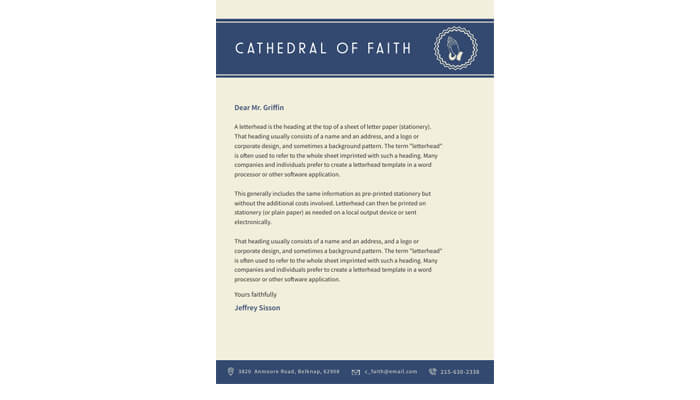
An example shows the use of fewer but higher contrasting colours in a letterhead’s design. It is easily readable, catches the eye, and doesn’t distract the reader from the contents of the document.
Select A Fitting Font
The rule of thumb here is to use the same font used in your other documentation and materials for your church. Things such as business cards, posters, graphics, etc should all have one consistent font that you will use here on the letterhead as well.
Fonts from the Roboto or the Futura LT family are appropriate-looking fonts with a modern feel that can work well on your letterhead. They create a professional impression for your readers and are easily comprehensible.
They make an excellent choice for use where you have to give information regarding your church such as an address, phone numbers, and email addresses.
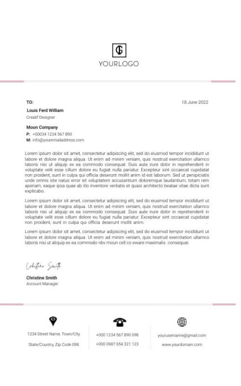
In this example here, the designer has chosen to use a font from the Roboto family in various areas including the main text body and where the company information can be found. The result is a sleek, modern, and professional-looking letterhead that is set to impress anyone who reads it.
Make A Layout
Using the draft as a guide, create a layout for your letterhead utilizing the different design elements available in the designing software of your choice. Many of these would be present already but it is best if you use similar design elements from existing marketing materials.
Some questions that can help you here are whether you need to add a full border around your letterhead, how to utilize a header and footer, and whether to incorporate background graphical elements or not, to name a few. Your design will become clearer as you answer these questions.
Match Other Stationery
To complete a set, you should consider ordering complimenting stationery. Things such as business cards, envelopes, note cards, etc with similar designs will become useful later on and you’re likely to get a better price for bulk orders.
Someone receiving a document written on the letterhead for your church in an envelope with similar designs will make a stronger impression than a letterhead in a plain envelope.
One thing to keep in mind with letterheads is to keep things simple. A letterhead is still essentially a sheet of paper that is used to print documents. There should always be ample space for that and the designs should not distract the reader from the written text.
For your church, a letterhead with your logo, contact information, and some design elements in two or three high-contrast colours can work better than a letterhead that is overloaded with different kinds of information and designs. Designing a letterhead for yourself can be a daunting task for many, but if you follow the advice listed in this article, you too can create an eye-catching letterhead for yourself that will leave a lasting impression on the readers.


